Development: WordPop Menus
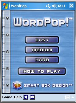
Well, it took a little longer than planned, but I have the splash screen, start screen, and the menus all visible in our WordPop overhaul. The screenshot is WordPop running on the new framework in a Windows Mobile 5.0 emulator.

What sidetracked me and took some time to sort out was a subtle change in the way menus are created under the WM5 SDK versus the PocketPC 2003 SDK we were using for all previous titles. Starting in Windows Mobile 5.0, Microsoft was encouraging software to stop using the menu bar that had been so common. Instead, they wanted you to use a two softkey approach. The menu bar is replaced by the softkey bar with only two slots for text items. The user would click on these to reveal a menu or to perform a common command. The advantage was that WM5 devices would have two softkey buttons on the face of the device, so the user could interact with the common command or the menu via device buttons alone (no need for a stylus). They wanted you to do something more like this at the bottom of your screen (this is from the Solitaire game):

However, this prevented us from providing our two graphic menubar buttons that started a new game and toggled the sound muting. We happen to only have two menus, but this still didn’t fit our needs. So, I opted to override the softkey bar and continue to use the older-style menu bar.
Furthermore, the way menus are described in the resources of the application had changed slightly to accommodate the new softkey bar. That meant changing how I described my menus to fit. All of this was poorly documented because they really want me to use the new look.
It’s all there, now, though. I will continue on by hooking up the standard dialogs WordPop has (About Box, Purchase Info, Preferences, etc.). I would like to hear from you about my decision to stick with the older style. I’m sure Todd would like to hear your thoughts, as well.
It’s always a balance between what we as the developers want to provide, what the customers expect, and what standard UI Microsoft would like for us to conform to. Let us know what you think.

To tell you the truth you menu boxes you have now have a OLD feel to them. I kinda like just a button to press and a menubar on the bottom or top pops up….Kinda like the way palm does it but on the PPC just but a menu button on somewhere on the screen and then unhide a menu bar….I also like the X for Exit be a True Close the Program exit and I prefer them to be in the upper right like most windows programs….I know I’m just one person but that is me…:)
Hi Micahel – Wyatt and I met about your comment and we agree with you. Thus we are taking your advice and the menu will now reflect the new 5.0 standard. This is why I love getting feedback as early as possible so details that we might miss are commented upon.