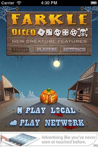
We went from, “Wouldn’t it be fun to create a Halloween version of Farkle!” to submitting it to Apple in 13 days flat. That was fast! The app came out great and is now with Apple pending approval. The Android version is not far behind.

 Click on image to see the entire art.

How we did it.

Zombie Asset Management – The entire team is required to use SVN to check in and out files. Thus all code, art, sound, text changes, even marketing material goes through this system. We decided up front that we would see how far we could get, in 7 days, by simply swapping out the current Farkle Dice files with new Halloween files, this is often called as skinning. Wyatt quickly made a branch off the trunk for the code and we dove in with our eyes wide shut. So like Zombies, no thinking allowed, simply replace what we had, one for one, a rule we had to break several times.

Terrifying Text – My first task was to change the localization text to terrifying text. Not every developer  makes a single file for all the text for the app, but we do, as we localize our games into other languages. Creating this file really paid off when making the Halloween version. Because instead of having to track down all the text strings, I had one file, that I was translating into something scary. So Player 1, became, Undead Player 1, AI player Stead Stan, became the Grim Reaper. Winning the game became Surviving. It was really fun thinking of ghoulish words to use.

Spooky Sounds – Finding new sound effects was very time consuming. I don’t have a library of Halloween sounds so I spend hours going through several sites I commonly use and gathered an online library of sound effects. While I was doing this, Jim was starting to hand off some art. After I saw the style of the art and the theme he was going for, I tossed many of the sounds I found and searched for new ones. Jim was creating art that reminded me of classic horror movies while I was headed in more of the modern Zombie direction. But his art was fantastic so I found werewolf howls, screams, blood splatters that I liked, purchased them, then renamed the files exactly what existed in the code for the non-Halloween version, and then checked them in. The hardest sound to find was for the title screen. I really wanted a spooky theme song, but I did not like anything I heard. They were either too dramatic, like Jason chasing you with a knife or the song reminded me of some satanical ritual. I did find some great ambiance tracks and the one I purchased worked great. I used Audacity to do some basic mixing of sound effects and editing. What a great free tool.

 Killer Art – Jim has been responsible for all the art for all our games for years. He was instantly enthusiastic and I think started to draw before the meeting was over. He handed off the title page first with some witch and bat animations and replaced the dice with pumpkins. This visual was a huge WOW. It also let me see a different side of Jim, a scary ghoulish side, which was great, although I am locking my doors now at my house. As I mentioned above, the art helped me focus the sound files. I think Jim must have drawn with both hands and feet because in about 5 days he had handed off most of the art for iPad, iPhone, including retina. We had very few discussions around the art as we trusted Jim to deliver.  I especially like the little things he added, like blood dripping on the characters name on the game board. Jim is now converting the art to work on Android tablets and phones.

Eerie Engineering – Wyatt quickly made a branch of the existing Farkle Dice code for the team to access and provided constant direction to the team when we had hand-off questions. Wyatt, took the lead designer role for the title screen and other areas. Jim handed off the art and I handed off  the sound effect. The only direction we gave Wyatt for the title screen was, “Make it fun” and he did. The bat flying around and the witch swopping by are some of my favorite parts of the app. To keep the QA minimal, we dropped iOS 3.x support and concentrated on 4.x – 5.x beta. Wyatt was making builds for us to try on a regular bases. And although we started out with the rule of one to one replacement, we handed off to Wyatt sounds that needed to play in new spots and new animations. Then at the very last day I asked Wyatt to add two custom fonts.  We were all tired by now, but Wyatt did it and now the menus and dialogs have that extra scary look.

Morbid Android – We are now repeating the process for the Android version. John is lead engineer and is having a lot of fun with the build. Because of the lead time needed for Apple to approve and since there is no approval for Google apps it made sense to start with the Apple version. John is rapidly creating the app and he is about 85% or more done. We converted the sound files to MP3 and Jim is redoing the size of the art. John has been sending builds almost hourly for us to review and adding his own design style to make it great on Android.

The App was the Spec – Beyond basic notes from our meetings, emails flying back and forth, and a few spreadsheets in Google Docs, there was no traditional specification. The App was a living prototype and specification along with the code.  When we discussed a design issue, we were either pointing to the game or to the code repository. Such as, look at this file, or here’s a screenshot, can you change this to that. This worked well given the time frame and our past experience working with each other paid off.

Email me at tsherman@smartboxdesign.com if you have any questions. I will post links to the stores as soon at the app is approved in iTunes and uploaded to Google Market and Amazon.


Last week, on May 13, we submitted an update to WordPop! iPad to Apple. We were excited about this new release because it supported landscape. Players would be able to enjoy WordPop! Volt on the iPad in all orientations. I personally really enjoy playing in landscape mode a bit more than portrait as I find holding the iPad horizontally easier.

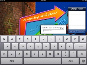
After a week, we heard back from Apple, the update was REJECTED. To quote Apple, “The iPad Human Interface Guidelines state that only one popover element should be visible onscreen at a time. On launch, and when the user taps the “Add Player” button, and additional popover is displayed for the user to enter a player name. Screen shots are attached for your reference.”

My team and I are aware of the one popover limit but the second popover is a dialog which I did not consider in the same class as a popover. Additionally, Apple had approved the two previous submissions of WordPop! Volt which has “Add Player” working exactly the same way.

Apple has been very good to us in that they usually provide a screen shot and description of what is wrong.

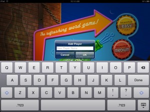
The fix is straight forward, we need to remove the first popover “Change Player” when “Add Player” is selected. This should be done any second now and we will resubmit.

Lesson learned, it does not matter what Apple calls the widget being used in the iPad User Interface Guidelines, only one “popover” at any given time.

Update: May 24, 2010 – We resubmitted WordPop! Volt. Below is a screen shot on the change. This new look conforms to the iPad UI guidelines.

WordPop! for iPad  – When to Use iPad UI Elements

The iPad Human Interface Guidelines describes split view, popover, modal dialogs, toolbars, keyboard and other readily available user interface elements built into the iPad. Usually productivity applications will by default use many of these UI elements, but what about games? Games designers typically create their own dialogs, tool bars, menus etc in the same style as the game itself with custom art and code.

Suspension of disbelief is an important psychological factor of game play. The more the player buys into the game environment the more engaged he or she will feel. Using iPad built-in UI elements chips away at this because they use the OS look and feel and reminds the player that they are playing a game. I like to think of it this way, if I am watching a movie and during an action scene the leading man suddenly turned to me and asked if I was enjoying the movie I would no longer be caught up in the moment and would enjoy the movie less.

In designing WordPop! for the iPad, Jim, Wyatt, and I had to decide if we would use the iPad UI elements or create them from scratch and if we do use then when and where? We decided to use several built-in elements for the following reasons.

1.    They are quick to implement.
2.    They are flexible.
3.    They are stable
4.    They are agile
5.    They are already compatible with the hardware

We decided to use the toolbar element. The toolbar will hold New Game, Preferences, Word List, Help, and About Us. Since all of these items are not part of the immediate game flow the suspension of disbelief is minimized.

Look for more peeks into our development of WordPop! for iPad in coming blogs. Please share this blog and follow Smart Box Design on Twitter.

Share/Bookmark

In my last blog I briefly explained the concept of flattening the design and gave an example with the description of the new game statistics board. The next layout decision was where to place New Game, Preferences, Word List, Help and About buttons. These buttons need to be quickly accessed when needed but are not the focus during game play.

When playing WordPop! the player’s focus will be centered on the middle third of the iPad. The player’s eyes will especially be focused on the Check button which is used to enter each word.  Two additional buttons, Undo and Rotate are near the bottom of the iPad screen. The statistic board is near the top of the iPad and has several buttons associated with it.

nav-buttons.jpg

After trying several mockups, New Game, Preferences, Help, Word List, and About buttons were placed on the bottom. When they were placed at the top of the iPad they were fighting for attention with the statistic board. Placing them on the left or right was aesthetically unpleasing, unbalanced with other elements and worst of all, made them too noticeable. Placing them on the bottom was the right fit. However, they were now too close to the Undo and Rotate game buttons. Jim Patterson using his design and layout skills rearranged them slightly up and to the right. This harmonized the design.

As we continue to add detail and features to the game we will continue to check and double check the layout.

Look for more peeks into our development of WordPop! for iPad in coming blogs. Please share this blog and follow Smart Box Design on Twitter.

Share/Bookmark