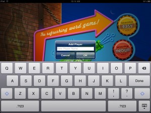
Last week, on May 13, we submitted an update to WordPop! iPad to Apple. We were excited about this new release because it supported landscape. Players would be able to enjoy WordPop! Volt on the iPad in all orientations. I personally really enjoy playing in landscape mode a bit more than portrait as I find holding the iPad horizontally easier.

After a week, we heard back from Apple, the update was REJECTED. To quote Apple, “The iPad Human Interface Guidelines state that only one popover element should be visible onscreen at a time. On launch, and when the user taps the “Add Player” button, and additional popover is displayed for the user to enter a player name. Screen shots are attached for your reference.”

My team and I are aware of the one popover limit but the second popover is a dialog which I did not consider in the same class as a popover. Additionally, Apple had approved the two previous submissions of WordPop! Volt which has “Add Player” working exactly the same way.

Apple has been very good to us in that they usually provide a screen shot and description of what is wrong.

The fix is straight forward, we need to remove the first popover “Change Player” when “Add Player” is selected. This should be done any second now and we will resubmit.

Lesson learned, it does not matter what Apple calls the widget being used in the iPad User Interface Guidelines, only one “popover” at any given time.

Update: May 24, 2010 – We resubmitted WordPop! Volt. Below is a screen shot on the change. This new look conforms to the iPad UI guidelines.

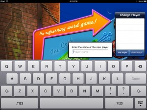
Jim’s recent hand-off of the title screen for landscape orientation. To be released in a few weeks as a free upgrade for all.

The iPad is being marketed as a very casual device as demonstrated by Steve Jobs on stage while sitting on a couch. The only way he could have looked more relaxed would be if he was in a t-shirt and boxers drinking a beer. His point was well taken by many including my team, the iPad will be used in the living room, den or some other communal space. This makes the iPad a shared device. Let me say that again, unlike the iPhone, which you might loan to someone for a brief moment, such as a friend at a coffee shop, the iPad is meant to be a shared device.

What does this mean for WordPop!? We’ve concluded that WordPop! will be shared among family members or friends, thus we will need a sign-in. This will allow several family members to start and play their own games and it will allow individual players to save multiple games. This is fantastic feature. One game could be played with the goal of getting the highest score ever on Medium Level while another game could be dedicated to making high scoring words for the Global All Time Best Words List. Even better, another game could be saved for a child who wants to practice making words (we’ve heard from several parents they use WordPop! in this way). Another advantage of having a sign-in is we can get a name up front for the High Score and Best Words pages.

I for one can’t wait until Wyatt finished with sign-in as I too want to play several games at once each with a different goal.

Sign-In Peek

If you are a developer and thinking of having sign-in make sure to plan this up front as it is a complicated feature if not thought out early. You will want to list out which items are saved per player and which items should be global, such as posting scores to our server. If you would like further information about our sign-in flow, please feel free to email me.

Look for more peeks into our development of WordPop! for iPad in coming blogs. Please share this blog and follow Smart Box Design on Twitter.

Share/Bookmark

WordPop! for iPad  – When to Use iPad UI Elements

The iPad Human Interface Guidelines describes split view, popover, modal dialogs, toolbars, keyboard and other readily available user interface elements built into the iPad. Usually productivity applications will by default use many of these UI elements, but what about games? Games designers typically create their own dialogs, tool bars, menus etc in the same style as the game itself with custom art and code.

Suspension of disbelief is an important psychological factor of game play. The more the player buys into the game environment the more engaged he or she will feel. Using iPad built-in UI elements chips away at this because they use the OS look and feel and reminds the player that they are playing a game. I like to think of it this way, if I am watching a movie and during an action scene the leading man suddenly turned to me and asked if I was enjoying the movie I would no longer be caught up in the moment and would enjoy the movie less.

In designing WordPop! for the iPad, Jim, Wyatt, and I had to decide if we would use the iPad UI elements or create them from scratch and if we do use then when and where? We decided to use several built-in elements for the following reasons.

1.    They are quick to implement.
2.    They are flexible.
3.    They are stable
4.    They are agile
5.    They are already compatible with the hardware

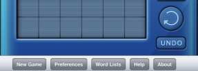
We decided to use the toolbar element. The toolbar will hold New Game, Preferences, Word List, Help, and About Us. Since all of these items are not part of the immediate game flow the suspension of disbelief is minimized.

Look for more peeks into our development of WordPop! for iPad in coming blogs. Please share this blog and follow Smart Box Design on Twitter.

Share/Bookmark

In my last blog I briefly explained the concept of flattening the design and gave an example with the description of the new game statistics board. The next layout decision was where to place New Game, Preferences, Word List, Help and About buttons. These buttons need to be quickly accessed when needed but are not the focus during game play.

When playing WordPop! the player’s focus will be centered on the middle third of the iPad. The player’s eyes will especially be focused on the Check button which is used to enter each word.  Two additional buttons, Undo and Rotate are near the bottom of the iPad screen. The statistic board is near the top of the iPad and has several buttons associated with it.

nav-buttons.jpg

After trying several mockups, New Game, Preferences, Help, Word List, and About buttons were placed on the bottom. When they were placed at the top of the iPad they were fighting for attention with the statistic board. Placing them on the left or right was aesthetically unpleasing, unbalanced with other elements and worst of all, made them too noticeable. Placing them on the bottom was the right fit. However, they were now too close to the Undo and Rotate game buttons. Jim Patterson using his design and layout skills rearranged them slightly up and to the right. This harmonized the design.

As we continue to add detail and features to the game we will continue to check and double check the layout.

Look for more peeks into our development of WordPop! for iPad in coming blogs. Please share this blog and follow Smart Box Design on Twitter.

Share/Bookmark