 Bellingham, Washington – Smart Box Design today is proud to announce that their highly entertaining and chart-topping Farkle game app series has been downloaded over 1 million times. This milestone makes the Farkle series one of the most popular dice games available for iPhones and iPads and Android phones and tablets.
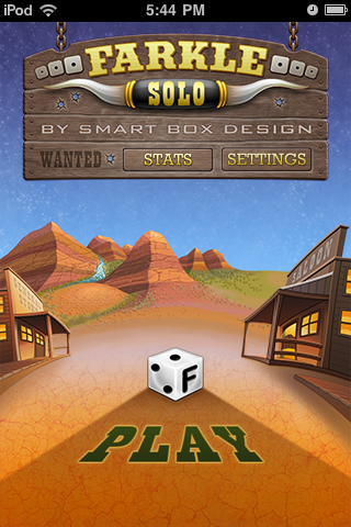
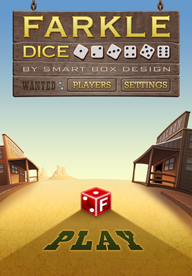
The Farkle series offers players an opportunity to challenge friends directly or compete worldwide on leaderboards. The series consists of Farkle Dice, a two or more player game, Farkle Solo, a single player version designed for players who love leaderboards, and Farkle Diced Halloween, a spooky version of Farkle Dice.
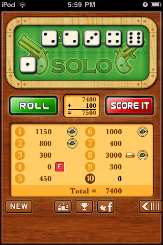
Farkle is an enormously popular game throughout the world. Players roll a set of six dice for points and can continue rolling the dice as long as their roll yield points. Any non-scoring roll is called a Farkle and the player forfeits their turn and any points accumulated during that turn. Like most games of chance and skill, Farkle’s attraction stems from players hoping to beat the odds and roll a high scoring combination.
Smart Box Design is known for the attention it places on both the playability and design of its games, and the Farkle series is no exception. There are very few dice games available for Apple iOS and Android with the quality and attention to detail that went into creating the Farkle series. It is beautifully designed with rich hues and entertaining music and sound effects. Each game in the series has an average 4.5 star rating in both the iTunes and Google Market.
“We are thrilled that players have discovered our games and have downloaded them over 1 million times,” said Todd Sherman, Smart Box Design’s president. “Our Farkle series provides phone and tablet users with a fantastic game that is easy to learn, quick to play, and very addictive!”
Farkle Dice, Farkle Solo, and Farkle Diced Hallowing are available for free. An ad-free option is being added to each game in 2012, starting with Farkle Solo.
Smart Box Design, based in Bellingham, Washington, was formed in 2003 by game industry veterans who share a common vision of creating exciting, high-quality, strategy and thinking games for mobile devices. Smart Box Design consults on mobile app development and creates apps for third parties in addition to producing their own games. Copyright (C) 2003-2012 Smart Box Design LLC. All Rights Reserved. Apple, the Apple logo, iPhone, iPod and iPad are registered trademarks of Apple Inc. in the U.S. and/or other countries.
 |
|||
|
|||
Farkle Diced game for Halloween haunts iPhones, iPads and Android
I am a big fan of prMac press release service. Below is my recent release through them. Feel free to use it as an example for when you need to write a press release.
Bellingham, WA Oct 14, 2011 in Games
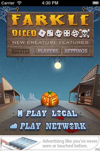
[prMac.com] Bellingham, Washington – Smart Box Design announced today the release of Farkle Diced, a Halloween edition of their chart-topping and highly entertaining game Farkle Dice for iOS and Android. The Halloween edition includes new ghoulish artwork, engaging eerie sound effects, ghostly achievements and plenty of scary surprises. Farkle Diced, Halloween edition, has quickly become a top 10 downloaded game, in the Apple app store Dice category.
Farkle Diced for Halloween is an exciting fast paced dice game for 2 – 4 players. The goal is to survive until your reach 10,000 points. You can try to beat the undead computer players or your zombie friends. You’ll have hours and hours of wicked entertainment.
Smart Box Design is known for the attention they place on both the playability and design of their games, and Farkle Diced is no exception. It is humorously designed paying homage to the 1950s B horror movie genre. There are very few dice games available for Apple iOS and Android with the quality and attention to detail that went into creating Farkle Diced. The game, which can be customized to accommodate regional rules, is extremely easy for users to pick up and begin playing upon installation.
“We had a blast making the Halloween version,” said Todd Sherman, Smart Box Design’s president. “Our players are in for a real treat when they play this classic game wrapped in tongue and cheek spooky theme.”
Supported Languages:
* US English, Danish, French, German, Japanese, Korean, Serbian and Spanish
Device Requirements:
* iPhone, iPod touch, and iPad
* Requires iOS 4.0 or later
* 17.1 MB
Pricing and Availability:
Farkle Diced Halloween HD 1.0 is free and available worldwide through the App Store in the Games category. It is also available for the Android platform.
Download for iPhone and iPad
Download for Android
Screenshot (Title)
Screenshot (Game Board)
Smart Box Design, based in Bellingham, Washington, was formed in 2003 by game industry veterans who share a common vision of creating exciting, high-quality, strategy and thinking games for mobile users. Smart Box Design licenses, develops, and publishes apps for iOS and Android devices. The company has previously released Farkle Dice, Triples, and WordPop!, Word Monaco Solitaire and Word Watch. Copyright (C) 2011 Smart Box Design LLC. All Rights Reserved. Apple, the Apple logo, iPhone, iPod and iPad are registered trademarks of Apple Inc. in the U.S. and/or other countries. Android is a registered trademark of Google.
###
We went from, “Wouldn’t it be fun to create a Halloween version of Farkle!” to submitting it to Apple in 13 days flat. That was fast! The app came out great and is now with Apple pending approval. The Android version is not far behind.
Click on image to see the entire art.
How we did it.
Zombie Asset Management – The entire team is required to use SVN to check in and out files. Thus all code, art, sound, text changes, even marketing material goes through this system. We decided up front that we would see how far we could get, in 7 days, by simply swapping out the current Farkle Dice files with new Halloween files, this is often called as skinning. Wyatt quickly made a branch off the trunk for the code and we dove in with our eyes wide shut. So like Zombies, no thinking allowed, simply replace what we had, one for one, a rule we had to break several times.
Terrifying Text – My first task was to change the localization text to terrifying text. Not every developer makes a single file for all the text for the app, but we do, as we localize our games into other languages. Creating this file really paid off when making the Halloween version. Because instead of having to track down all the text strings, I had one file, that I was translating into something scary. So Player 1, became, Undead Player 1, AI player Stead Stan, became the Grim Reaper. Winning the game became Surviving. It was really fun thinking of ghoulish words to use.
Spooky Sounds – Finding new sound effects was very time consuming. I don’t have a library of Halloween sounds so I spend hours going through several sites I commonly use and gathered an online library of sound effects. While I was doing this, Jim was starting to hand off some art. After I saw the style of the art and the theme he was going for, I tossed many of the sounds I found and searched for new ones. Jim was creating art that reminded me of classic horror movies while I was headed in more of the modern Zombie direction. But his art was fantastic so I found werewolf howls, screams, blood splatters that I liked, purchased them, then renamed the files exactly what existed in the code for the non-Halloween version, and then checked them in. The hardest sound to find was for the title screen. I really wanted a spooky theme song, but I did not like anything I heard. They were either too dramatic, like Jason chasing you with a knife or the song reminded me of some satanical ritual. I did find some great ambiance tracks and the one I purchased worked great. I used Audacity to do some basic mixing of sound effects and editing. What a great free tool.
Killer Art – Jim has been responsible for all the art for all our games for years. He was instantly enthusiastic and I think started to draw before the meeting was over. He handed off the title page first with some witch and bat animations and replaced the dice with pumpkins. This visual was a huge WOW. It also let me see a different side of Jim, a scary ghoulish side, which was great, although I am locking my doors now at my house. As I mentioned above, the art helped me focus the sound files. I think Jim must have drawn with both hands and feet because in about 5 days he had handed off most of the art for iPad, iPhone, including retina. We had very few discussions around the art as we trusted Jim to deliver. I especially like the little things he added, like blood dripping on the characters name on the game board. Jim is now converting the art to work on Android tablets and phones.
Eerie Engineering – Wyatt quickly made a branch of the existing Farkle Dice code for the team to access and provided constant direction to the team when we had hand-off questions. Wyatt, took the lead designer role for the title screen and other areas. Jim handed off the art and I handed off the sound effect. The only direction we gave Wyatt for the title screen was, “Make it fun” and he did. The bat flying around and the witch swopping by are some of my favorite parts of the app. To keep the QA minimal, we dropped iOS 3.x support and concentrated on 4.x – 5.x beta. Wyatt was making builds for us to try on a regular bases. And although we started out with the rule of one to one replacement, we handed off to Wyatt sounds that needed to play in new spots and new animations. Then at the very last day I asked Wyatt to add two custom fonts. We were all tired by now, but Wyatt did it and now the menus and dialogs have that extra scary look.
Morbid Android – We are now repeating the process for the Android version. John is lead engineer and is having a lot of fun with the build. Because of the lead time needed for Apple to approve and since there is no approval for Google apps it made sense to start with the Apple version. John is rapidly creating the app and he is about 85% or more done. We converted the sound files to MP3 and Jim is redoing the size of the art. John has been sending builds almost hourly for us to review and adding his own design style to make it great on Android.
The App was the Spec – Beyond basic notes from our meetings, emails flying back and forth, and a few spreadsheets in Google Docs, there was no traditional specification. The App was a living prototype and specification along with the code. When we discussed a design issue, we were either pointing to the game or to the code repository. Such as, look at this file, or here’s a screenshot, can you change this to that. This worked well given the time frame and our past experience working with each other paid off.
Email me at tsherman@smartboxdesign.com if you have any questions. I will post links to the stores as soon at the app is approved in iTunes and uploaded to Google Market and Amazon.

