WordPop! for iPad  – When to Use iPad UI Elements

The iPad Human Interface Guidelines describes split view, popover, modal dialogs, toolbars, keyboard and other readily available user interface elements built into the iPad. Usually productivity applications will by default use many of these UI elements, but what about games? Games designers typically create their own dialogs, tool bars, menus etc in the same style as the game itself with custom art and code.

Suspension of disbelief is an important psychological factor of game play. The more the player buys into the game environment the more engaged he or she will feel. Using iPad built-in UI elements chips away at this because they use the OS look and feel and reminds the player that they are playing a game. I like to think of it this way, if I am watching a movie and during an action scene the leading man suddenly turned to me and asked if I was enjoying the movie I would no longer be caught up in the moment and would enjoy the movie less.

In designing WordPop! for the iPad, Jim, Wyatt, and I had to decide if we would use the iPad UI elements or create them from scratch and if we do use then when and where? We decided to use several built-in elements for the following reasons.

1.    They are quick to implement.
2.    They are flexible.
3.    They are stable
4.    They are agile
5.    They are already compatible with the hardware

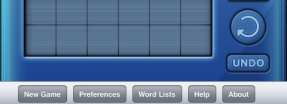
We decided to use the toolbar element. The toolbar will hold New Game, Preferences, Word List, Help, and About Us. Since all of these items are not part of the immediate game flow the suspension of disbelief is minimized.

Look for more peeks into our development of WordPop! for iPad in coming blogs. Please share this blog and follow Smart Box Design on Twitter.

Share/Bookmark

In my last blog I briefly explained the concept of flattening the design and gave an example with the description of the new game statistics board. The next layout decision was where to place New Game, Preferences, Word List, Help and About buttons. These buttons need to be quickly accessed when needed but are not the focus during game play.

When playing WordPop! the player’s focus will be centered on the middle third of the iPad. The player’s eyes will especially be focused on the Check button which is used to enter each word.  Two additional buttons, Undo and Rotate are near the bottom of the iPad screen. The statistic board is near the top of the iPad and has several buttons associated with it.

nav-buttons.jpg

After trying several mockups, New Game, Preferences, Help, Word List, and About buttons were placed on the bottom. When they were placed at the top of the iPad they were fighting for attention with the statistic board. Placing them on the left or right was aesthetically unpleasing, unbalanced with other elements and worst of all, made them too noticeable. Placing them on the bottom was the right fit. However, they were now too close to the Undo and Rotate game buttons. Jim Patterson using his design and layout skills rearranged them slightly up and to the right. This harmonized the design.

As we continue to add detail and features to the game we will continue to check and double check the layout.

Look for more peeks into our development of WordPop! for iPad in coming blogs. Please share this blog and follow Smart Box Design on Twitter.

Share/Bookmark

When reading the advice from Apple in the iPad Human Interface Guidelines it is clear the language and tone assumes the developer is coming from the iPhone and is in the process of converting their iPhone app to an iPad app. Thus someone came up with the idea of describing the iPad UI as flattening the iPhone version. This is really just a very odd way of saying, “You have more real estate to use, put everything on the screen that you can that is important, and no need to hide it on other screens like you did for the iPhone version.”

When Jim, Wyatt and I were redesigning WordPop! for the iPad we asked ourselves what additional elements would engage and entertain our players in addition to the game itself. One answer was game statistics. The Best Words and High Score Global List stats are very popular among WordPop! players. They compare the player’s current game and words to other players, which then acts as an incentive to do even better as you want to beat the current high score or best word on the global list. However, the stats were hidden in the menu (two taps away). By moving the stats out of the menu system and onto the game board would result in “Flattening the Design“.

However, we all felt it was not enough to just move the existing stats. Thus we decided to add more fun stats, many of which were recommended to us by players of WordPop! for the iPhone. When the iPad version of WordPop! is released, players will be able to compare their game to several new, important, and exciting stats that will act as another incentive per round and word to do better.

Look for more peeks into our development of WordPop! for iPad in coming blogs. Please share this blog and follow Smart Box Design on Twitter.

Share/Bookmark

The iPad is designed without a specific orientation. Applications will mostly be viewed in portrait or landscape mode, however for games it can be put on a table and viewed from above (such as playing checkers).

One of the first steps in redesigning WordPop! for the iPad was to create some simple layouts for each orientation. At first we were not sure if we had to support both landscape and portrait, as this was not required for the iPhone. There was much debate in chat rooms but it was soon put to rest with this simple quote from The iPad Human Interface Guidelines “Although you might not have supported all orientations in your iPhone application, you must do so in your iPad application.” With that now settled we created a wire frame layout for each orientation. This gave us an idea on how much room to reserve for the WordPop! machine and how much space remained for new features.

One of the new features is displaying the high scores and other data in a fun and refreshing way. Here is a quick mock-up from Jim Patterson.
High Scores Orientation A

This layout works well in but is too wide for the other orientation. The solution is to change what is displayed. Thus when in the iPad is rotated 90 degrees the date column is removed as shown in this very rough mock up.

High Scores Orientation B

Although we do temporarily hide the date it can be brought back instantly by rotating the iPad 90 degrees in either directions. (We did discuss using a smaller font, but it felt too jarring. This solution kept the UI consistent and offered a better experience.)

I think players of iPad games will see some display information come and go when different orientations are used (FYI – Watch the demo of email on the iPad at www.apple.com.  The mail list is hidden in portrait mode which is similar to what we are doing.).

Although supporting both orientations will be a challenge  and add to the overall scope of the project it will add to the uniqueness of the iPad.

Look for more peeks into our development of WordPop! for iPad in coming blogs.

Share/Bookmark

top_scoring_ipad.jpg

We have been having a great time working on WordPop! for the iPad. During March the team will be blogging about their thoughts and tasks as we race to finish WordPop! in time for the iPad release (which is still TBD but we are all watching Apple closely).

After the iPad was announced we had a exciting meeting and answered several key questions.

Q: What did we think of the iPad?
A: We loved it and thought it was going to fill an important niche market.

Q: Could we offer our players a great gaming experience?
A: Yes, the extra real estate will be used to add even more engagement to the game.

Q: Should we create a new game from scratch or redesign one of our current games?
A: We decided to redesign one of our current games and felt either Farkle Dice or WordPop! would be the best candidates. We sent a poll to our registered users and WordPop! was the clear leader receiving over 40% of the votes.

Q: What next steps should be taken?
A. All team members to read the new Human Interface Guidelines for the iPad and to install the SDK to gain access to the simulator.

Check back as I will be writing regularly about our development efforts and I will be posting more images as we get closer to the final look. Above is a screen shot taken from the simulator.

Please comment and let me know what you are interested to hear about in regards to iPad, gaming, WordPop!, etc.

Share/Bookmark